GREYHOUND CANADA WEBSITE REDESIGN
User Research and Design
12 MIN READ
The Low Down
I worked as a user experience designer with a team to redesign the information architecture of the current Greyhound.ca desktop site. Through the use of user research, wireframe development, prototyping and iterative design, we informed and designed the information architecture to better suit users' needs and experience while also balancing the goals of the business. The final product is a mid-fidelity clickable prototype with more intuitive labeling and enhanced navigation capabilities.
PLATFORM
DESKTOP
METHODS
INTERVIEWS
CARD SORTING
WIREFRAMING
PROTOTYPING
TYPE
ACADEMIC WORK
TOOLS
FIGMA
INVSION


Mid-fidelity wireframes of the newly redesigned Greyhound.ca website
Get a closer look at the prototype!
Background
Greyhound Canada provides bus transportation between cities all across Canada. The current site (launched in the year 2000) allows users to purchase tickets, learn about their routes, and much more.
The Challenge
Our team was challenged with assessing the information architecture (IA) of the current Greyhound Canada website. Through a quick-and-dirty heuristic evaluation, we discovered that the current IA does not provide the best possible user experience, especially surrounding the website’s main goal of ticket purchasing and management. The key issues identified during the preliminary heuristic evaluation of the website included information overload, a business-centered organizational structure, non-intuitive labeling and poor findability (all making for a painful time when searching for information)

NO SEARCH CAPABILITIES

LACK OF DROP DOWN NAVIGATION
WALLS OF TEXT
Screenshots of current website's information architecture issues

The Process
Our team got to know each other and the website at the same time through beginning the redesign by asking what content was currently on the site; we accomplished this by performing a content analysis. We decided to begin by following the URL for each page and documented where content lived versus where it surfaced on the site. We also conducted a competitive analysis to determine what other sites were doing well or not so well (let’s not make the same mistakes!) when it came to content organization and labeling.
We then identified the site's key user groups to be Students, Young Professionals, and Seniors based on who Greyhound determined to be their most frequent travellers.

DATA COLLECTION AND ANALYSIS
To kick off data collection, my team and I interviewed 3 people, and conducted closed card sorts with 3 different people both in person and remotely. We combined the interviews with a task analysis to allow us to see how the user actually used the current site, not how they remember using it (we can't depend solely on participants' recall!) I analyzed the qualitative data using an affinity diagram to obtain the most important themes from the stakeholders interviewed. The card sort was also analyzed to identify any issues with content groupings and labelling on the site.

Sticky notes galore, aka theme visualization for the win
Analysis through affinity mapping helped us to identify that:
-
participants are currently unable to access schedules, station locations, discount information, and ticket printing functionalities easily
-
participants find navigating the site difficult, and are unable to determine where they are
-
lack of a drop down navigation menu was frustrating to participants who are unclear what lay beneath the labels
The card sort analysis revealed that:
-
participants found labeling of the global navigation menu to be vague and unclear.
All in all, the Greyhound Canada website left participants
"...confused and lost with no clear indication of where to go"
Sticky notes galore, aka, theme visualization for the win
The Impact
I CAN SEE CLEARLY NOW...
With our analysis results in hand, our team proceeded to tackle the (oh so many) problems identified. I began by creating an Information Architecture Schematic Diagram of the proposed redesign to the current Greyhound site with new navigation structuring, content organization, labelling, and search capabilities.
NAVIGATION STRUCTURE & SEARCH CAPABILITIES
how can users' placemaking and navigation capabilities on the site be improved?
CONTENT
ORGANIZATION
what common user tasks can the content be organized around? how best can we decrease the walls of text?
LABELLING
how can the labels be clearer and more intuitive for the users?
The Impact
The Impact
The Impact
The team came together to then develop our design goals to remedy the issues found on the site. We fulfilled our established design goals for the current site redesign by first taking a view on what the common tasks performed by users would be by developing tasks, use cases and scenarios. This allowed us to see where and how our proposed design solutions would suit the needs and wants of the Greyhound Canada website user. In combination with our analysis and audits, this led us to include clear and direct labels on the global navigation and the implementation of a search bar to allow for search capabilities.
IDEATION
I created low-fidelity sketches to begin our ideation process. My focus was on decreasing the information overload and cognitive load faced by the user on the current site and ensuring that they knew what options they had to move forward.
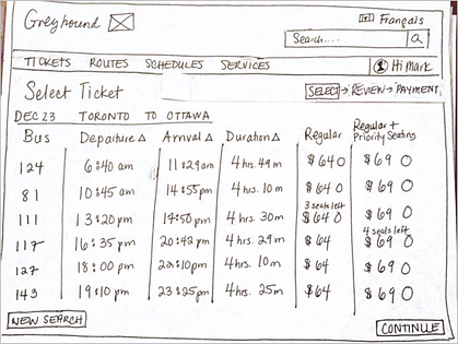


Sketches outlining browsing, saving, and payment screens
I then tested the sketches with users to get feedback on the layout and clarity of the content organization and labelling. After this, I iterated on the design again to produce mid-fidelity wireframes.

Current global navigation menu
GLOBAL SEARCH CAPABILITES

CLEAR NAVIGATION LABELS
DROP DOWN MEGA MENU
Redesigned search, labelling and navigation on home page
After another round of testing and design iterations, our team assembled and used our developed use cases to create a clickable prototype.
Check out the prototype!
Key Takeaways
ITERATION, ITERATION, ITERATION: A designer’s work is never really finished; the product is never finished; there’s always something that can be tested and changed. Given more time on this project, the final hi-fidelity product may include a slightly different user flow or perhaps labels dependent on the user group tested.
CLEAR AND INTUITIVE LABELS SAVE USERS TIME AND FRUSTRATION: Depending on users' developed mental models, this can vary amongst user groups so finding the best option to be understandable to all user groups is key.
BE INTENTIONAL ABOUT EACH DESIGN DECISION BY CONTINUOUSLY ASKING "WHY": Why does that drop down need to be a mega menu and what does that provide the user? Does that word have the same meaning within all our user groups? I found myself asking a question for every design decision, which I found helpful to find redundancies and better options for those decisions. My incessant curiosity seems to have a great purpose in this field!