BEAUTY BOOKING APP DESIGN
Product Management
2 MIN READ
The Low Down
I worked as a Product Manager to conduct user research in order to inform the design of a mobile app centered around finding and booking beauty services. I created user personas, conducted interviews, performed task analysis, and created low-fidelity sketches to provide to the development team. I reiterated on the design with the development team to inform the final product.
TYPE
PERSONAL
METHODS
GOOGLE FORMS
SKETCH
MARVEL
XTENSIO
TOOLS
SURVEYS
WIREFRAMING
The Task
I was enlisted to perform user research to inform the design of a mobile app centered around finding and booking beauty services.
The Process
I began with researching the two user groups for this app: Beauty Service Providers and Beauty Service Users. I investigated what their wants and needs were and what drives them to seek out beauty services by reading forums, watching YouTube videos in response to current digital tools on the market, and by reading articles on the web. This aided me in creating user personas for each user group.


Freelance Beauty Service Provider user persona


Freelance beauty service seeker user persona
I then conducted a competitive analysis of current digital tools available, focusing on features they provide and their interface layout.
DATA COLLECTION & ANALYSIS
To conduct interviews concerning issues that users currently face with finding beauty services in their area, I recruited participants from both user groups through social media platforms: 8 Beauty Service Providers and 8 potential Beauty Service Seeker users of the platform. These mainly came from family, friends, and friends of friends (networks are the bomb!). I created the interview questions while keeping in mind previously researched grievances of users of similar platforms and common features in those platforms.
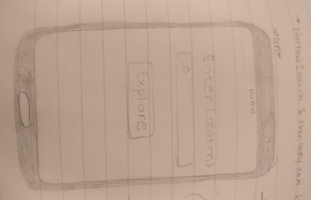
With my qualitative data in hand gathered from the interviews, I used affinity mapping to help visualize and organize the themes from the participants' responses. Next, I moved on to the ideation stage, complete with brainstorming and low-fidelity sketches to get all my ideas out of my head and onto paper.


Affinity mapping themes sorted by colour and category (theme)
Sketches of explore pages and booking page
The Impact
SO NOW WHAT?
I then converted the low-fidelity sketches into a mid-fidelity clickable prototype and previewed it with the development team and stakeholders. I collected feedback from the mid-fi prototype, iterated on the design and converted that into a high-fidelity clickable prototype using Sketch and Marvel. The final product includes features that, according to the interviews conducted, are very important to potential beauty service users. These included geolocation features, reviews of the service provider and photos of the provider's work.
Moving forward, I will be working to manage the marketing strategy and consult on customer acquisition opportunities.
Some artifacts from this case study are unavailable as of now since the project is not yet complete. But if you have any other questions, feel free to contact me!
Key Takeaways
DON'T GO STRAIGHT TO HIGH FIDELITY: Even though going straight to pretty pictures and realistic layouts is a very tempting path to take, I found that taking the time to test something as low-fi as sketches was invaluable. I got to catch onto content organization issues or layout problems before putting in the extra work by going straight to hi-fidelity.